Product DesignerDesigner
Classmate
open linkProblem Overview
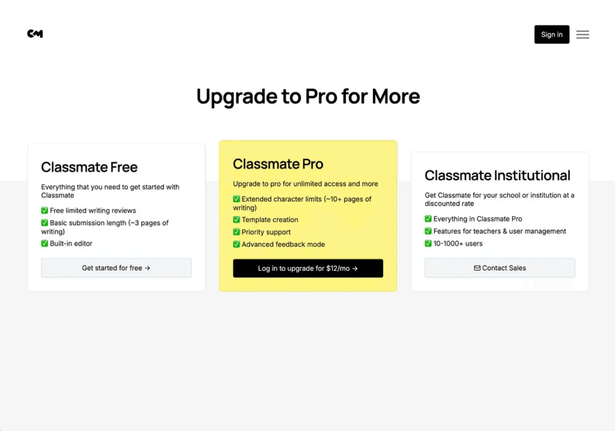
Small user base stalls traction, while poor onboarding fails to guide users toward premium features.
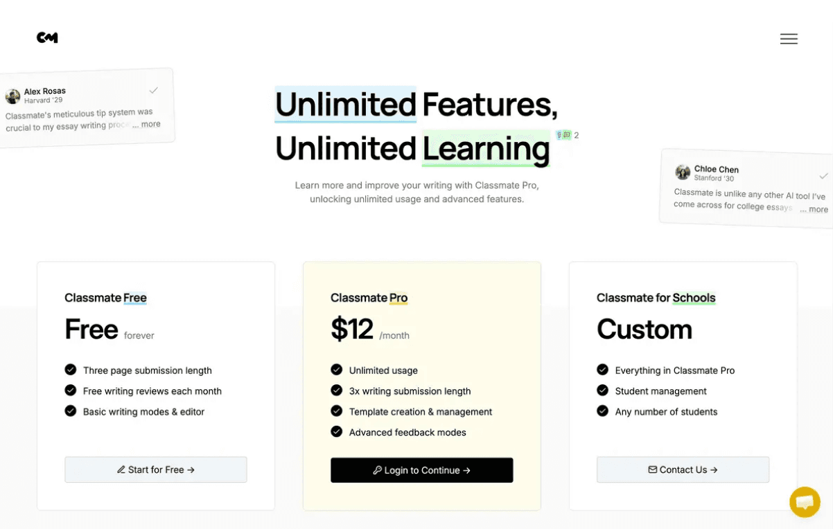
Final Design
Throughout my first iteration, my top priorities were:
- How do we incorporate user activity to bring trust onto the platform
- What design systems invite users to start transactions
- What might overwhelm or deter the user from using Classmate
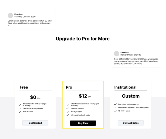
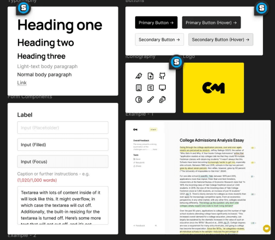
My focus for the initial prototype was to implement user feelings and comments with their experience with Classmate. Implementing them on the landing page of the payment screen felt necessary to establish trust and certainty with the user base to complement the header. Having a simple non-scroll page would reduce the amount of scrolling users would do to find details and increase transparency. For the final design, I implemented Classmate's theme with underlines and highlights to replicate its editing features with bright colors, adding interactive reviews when hovered over, and small details such as the comments next to the header that lead to the reviews.
Initial Design